Our task is that I am an independent digital imaging company and I have been asked to design a sample cover and double page spread for a brand new magazine to be pitched to The Hearst Corporation.
Front Cover Magazine Designs
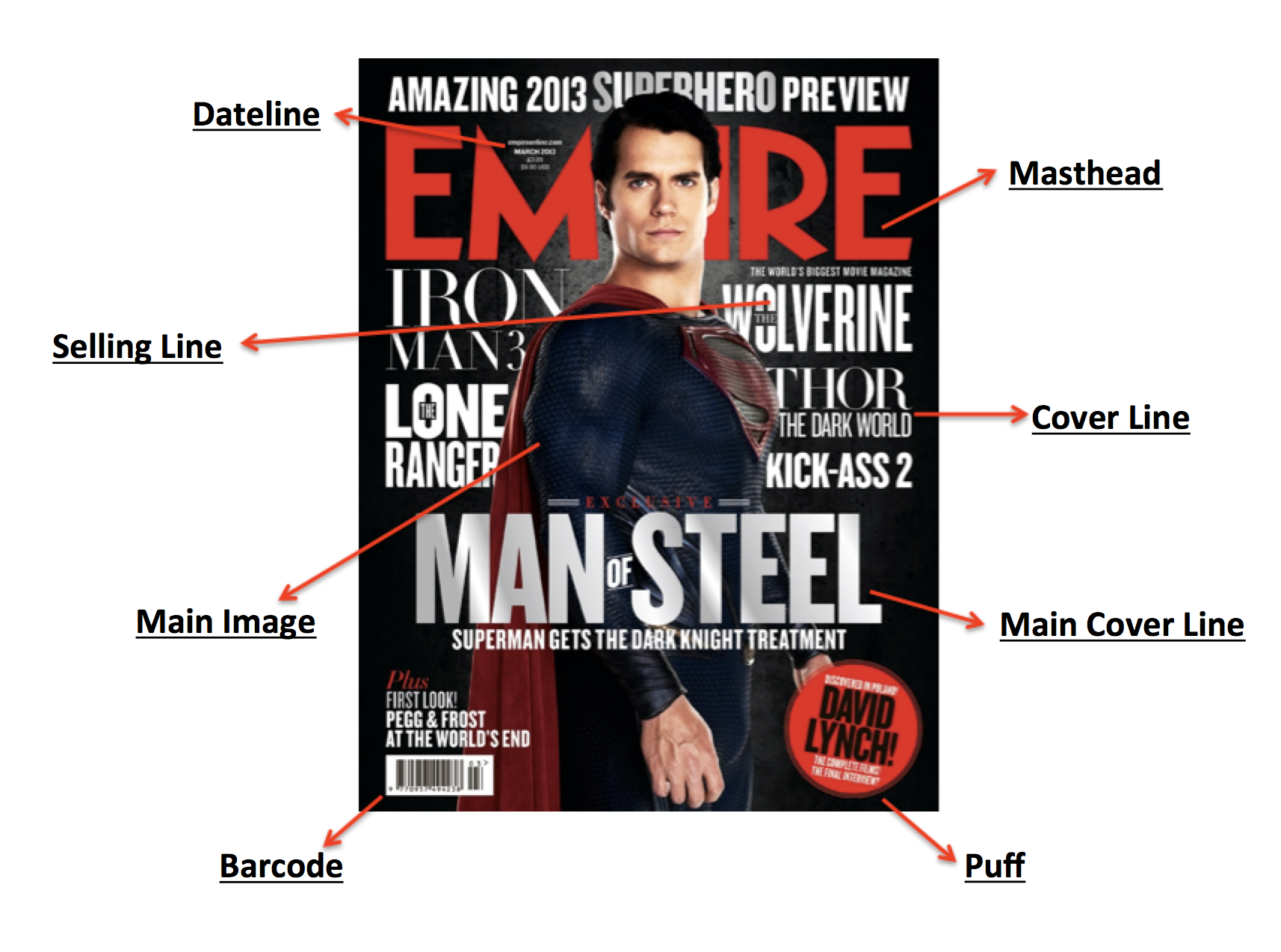

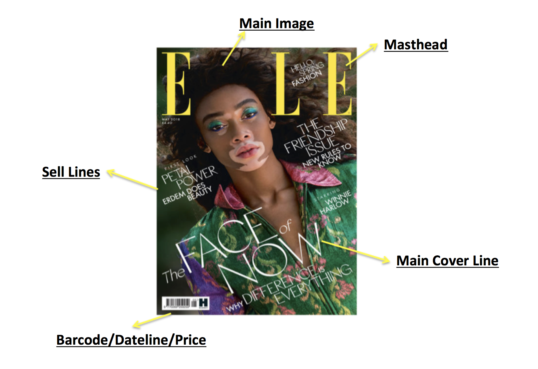
Masthead: The title/name of the magazine which is in a specific typeface. Its role is to be recognisable in turn being the visual branding.
Barcode/Dateline: Showcases the month and year of the publication of the magazine, has the price, dateline, and website of the magazine.
Main Image: The focal Image that is the biggest out of all of them. The main image is most of the time a real person who has a type of address towards the audience. It’s usually a medium close up or close up.
Cover Lines: They tell the audience the stories that are in the magazine. Normally, they are spread across and around the magazine cover.
Main Cover Line: It has the same role as a regular cover line but it is bigger and represents the important article that is featured inside the magazine.
Puff: An incentive which is placed on the cover to make something stand out. Usually by putting text into a shape.
Selling Line: Conventions of magazines which will get people wanting to buy it.
Double Page Spread Magazine Designs
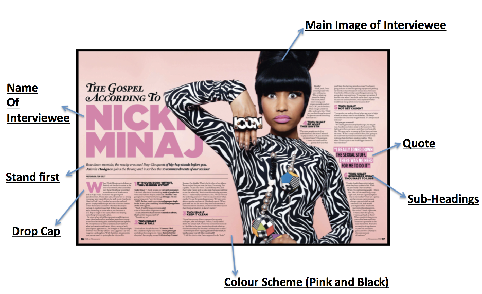

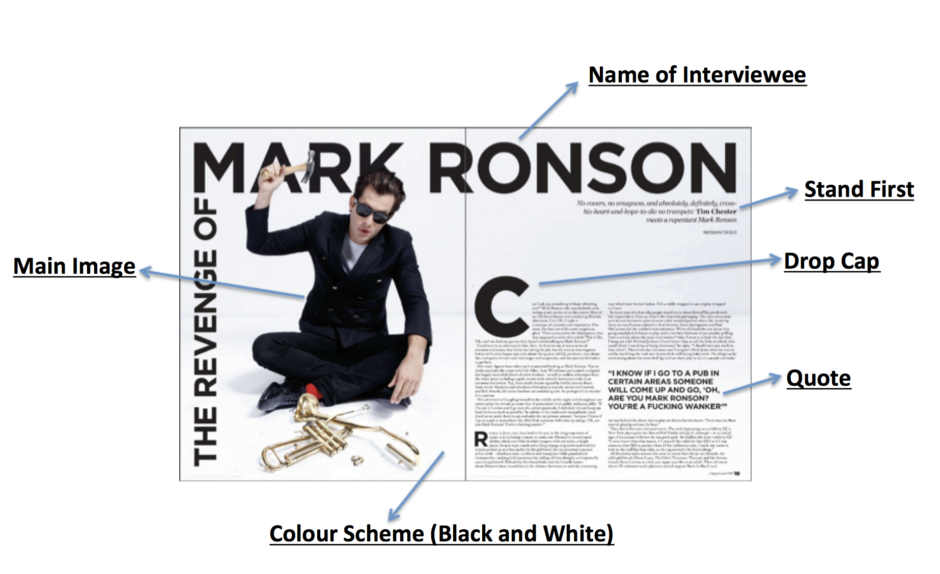
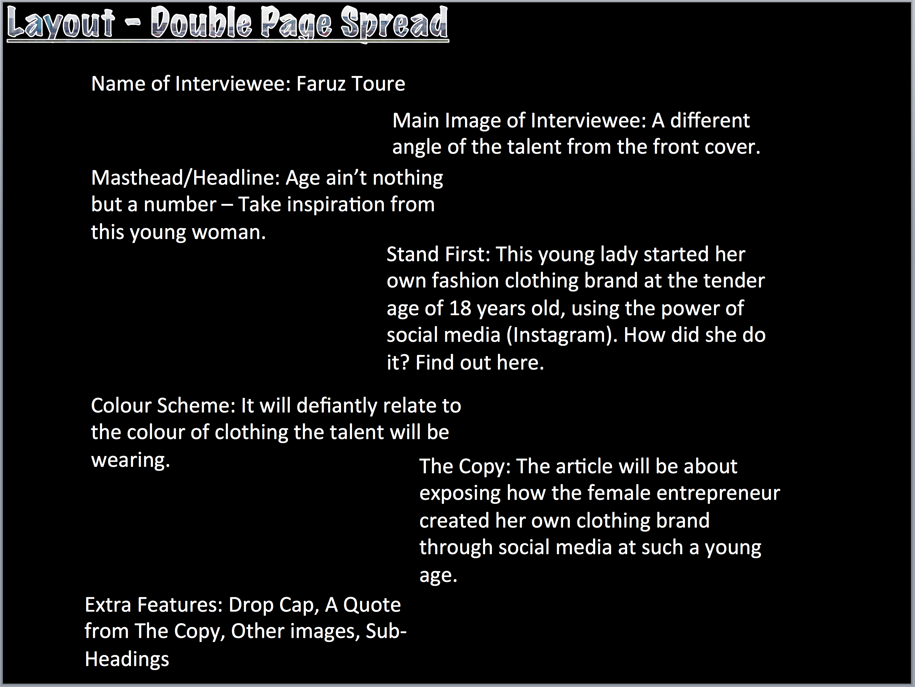
Main Image of Interviewee: One large picture which takes up to a whole page and sometimes bleeds between pages. Sometimes the picture is across the whole DPS with all text on the picture.
Name of interviewee: It shows who the DPS is about and creates a celebrity endorsement effect.
Quotes: Used sometimes in the title/headline on the picture stand first or to break up the text.
Sub-Headings: Separates the article by categorising them in terms of their context. Often used when the article is a Q&A.
Stand First: Introduces the article and is positioned at the beginning of the headline.
It also often includes the journalists name.
Drop Cap: First letter of the article is bigger to show you where to start reading.
There are other techniques for the same thing that includes bold text, slightly bigger type space, capitals at the start of the article.
Colour Scheme: DPS tend to stick to the colour scheme of the rest of the magazine to avoid being overpowered. Often the colour scheme connotes the genre; for instance rock magazines tend to have a lot of black.
Other/Secondary Images: DPS typically feature extra images, which are smaller but till relate to the article. All of the images are edited in the same way as the main images, keeping the house style constant.
Photojournalists
As we are going to be taking pictures for our front covers and double page spread, I will need to understand and be familiar with photographers that are sort after by the magazine industry.
I picked 3 famous photographers and will create a mood board; showcasing their work, style, and if their images have a specific target audience. The 3 photojournalists are Sebastião Salgado, Annie Leibovitz and Andreas Gursky.
Sebastião Salgado
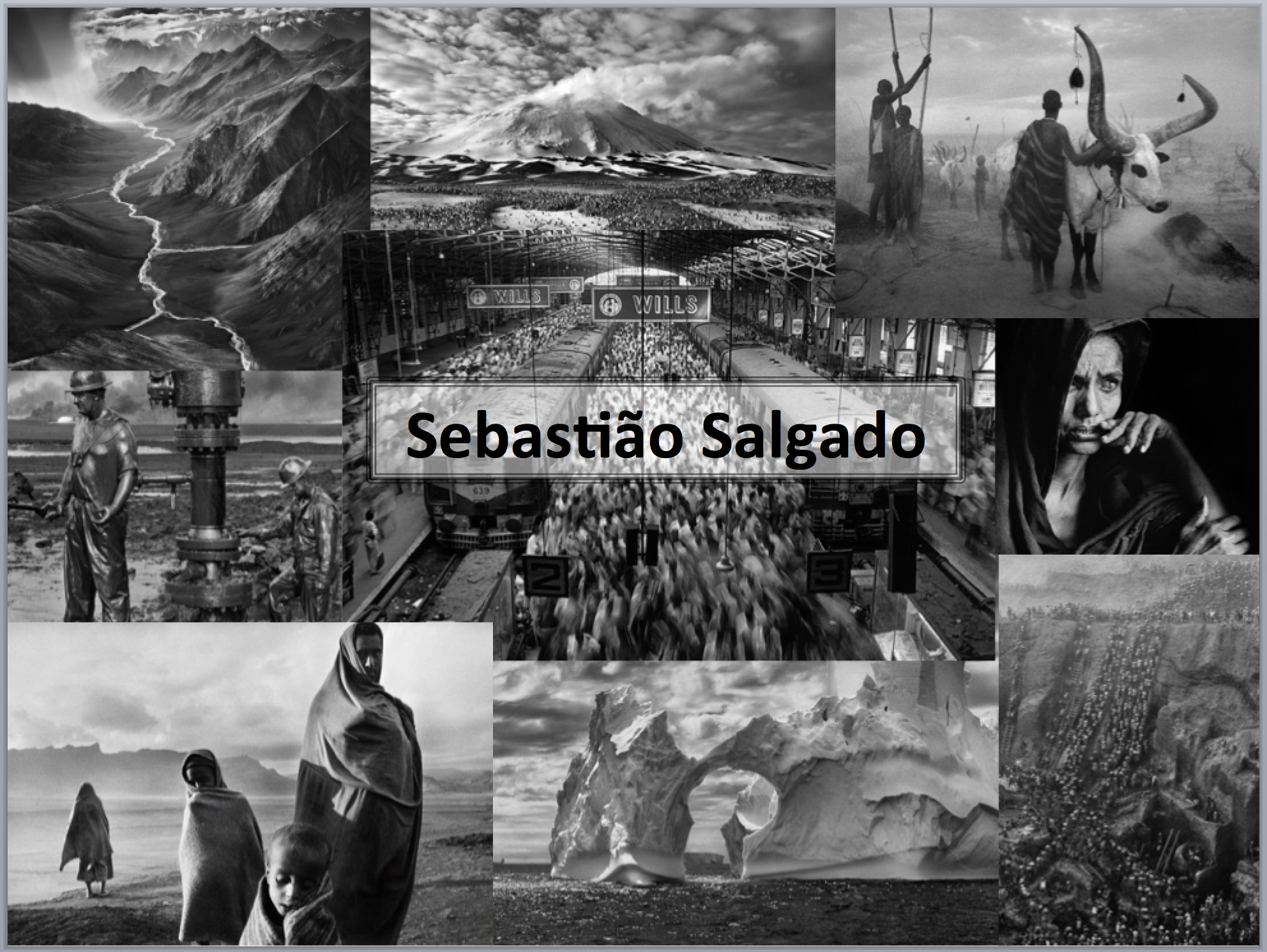
His style is that he document the lives of people the world over, finding beauty, strength and hope even in those in the bleakest of circumstances. This explains most of his photography work being in black and white that are both ‘highly formal’ and ‘unflinchingly documentary’. Salgado travels the world documenting the poor and powerless, as well as the grandeur of nature. Salgado’s pictures are sometimes disturbing and not for the faint of heart so it is targets adults that will be able to stomach and process the demographics of the third world.
Annie Leibovitz

Her style is renowned for her dramatic, quirky, and iconic portraits of a great variety of celebrities. Most of the pictures she takes are of people, showing off their facial expressions/structure, what they are wearing, and a background that relates to the atmosphere of the picture. She has created some of the most controversial and popular images of the last 40 years, and continued the creative artistic photographic legacy of established magazines such as Vanity Fair. She is targeted towards all ages that are interested in the celebrity world. Leibovitz has done Disney-themed celebrity portraits which targeted children to teenagers, even adults – practically anyone who is young at heart.
Andreas Gursky
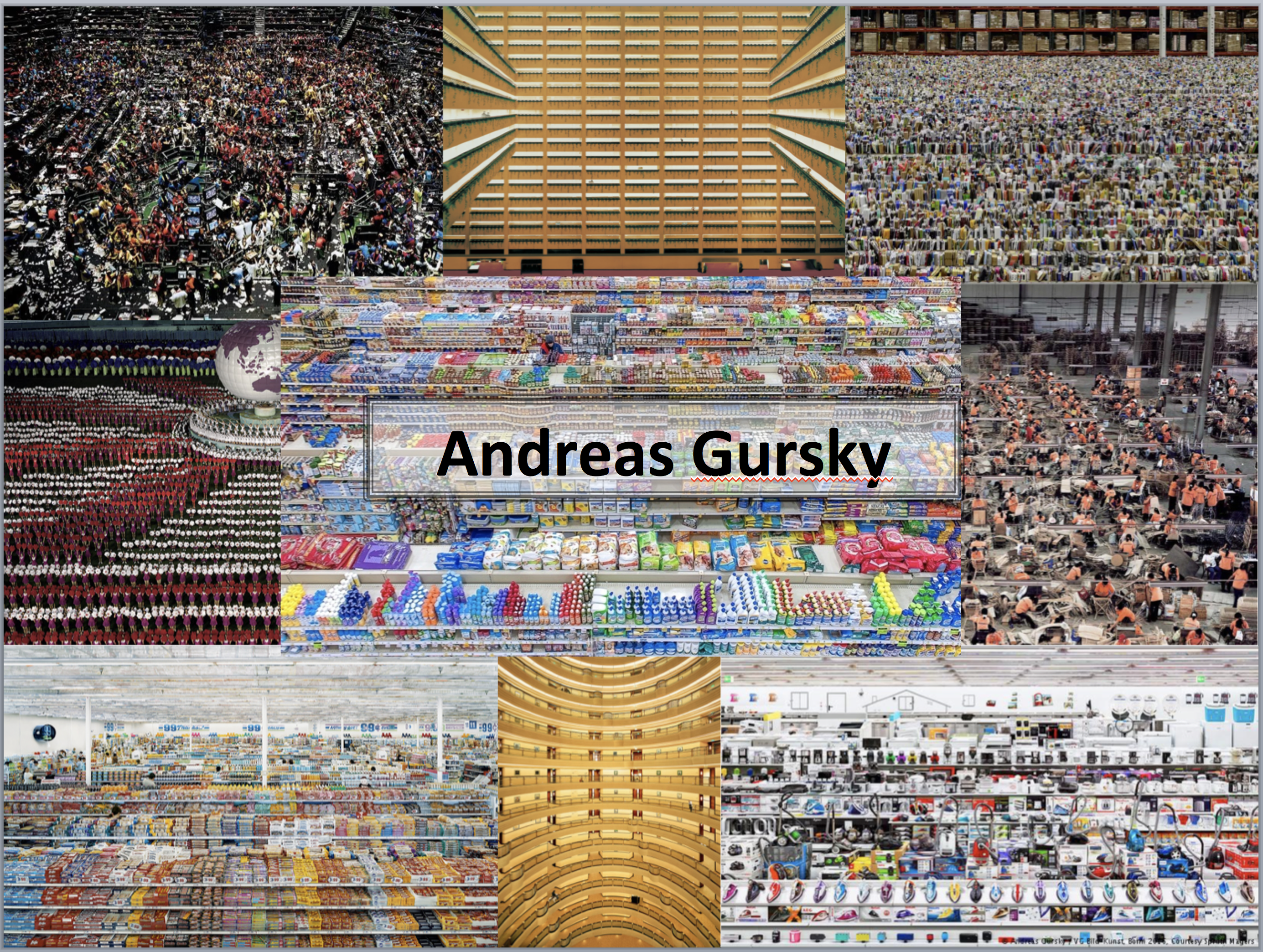
His style is to document vast, large places such as stock exchanges, concert arenas, big box stores, sweeping landscapes, racetracks, and other locations, which engage in regular relationship with the human population. Gursky’s photographs are often shot from an elevated, aerial perspective; this allows viewers to experience a scene in its full proportions. The pictures he took positioned him as an important bridge between the old ways of shooting and presenting pictures and the current highly, technologically advanced era of photography. His images are targeted towards who like architecture that create illusions.
Abstract Images
Abstract photography represents a visual image that does not relate to the object world and been created through the use of photographic equipment, processes and materials.


Our task was to go take the abstract images we used our current surroundings (James Watt college) to find and obtain the images. Firstly, we took pictures of potential abstract images inside the college which included lights, the inside of a BMW prop engine, and a vase. We also went outside and used the weather as an advantage. It was raining so we took pictures of rain droplets, street ponds, and a ‘road of cigarettes’.
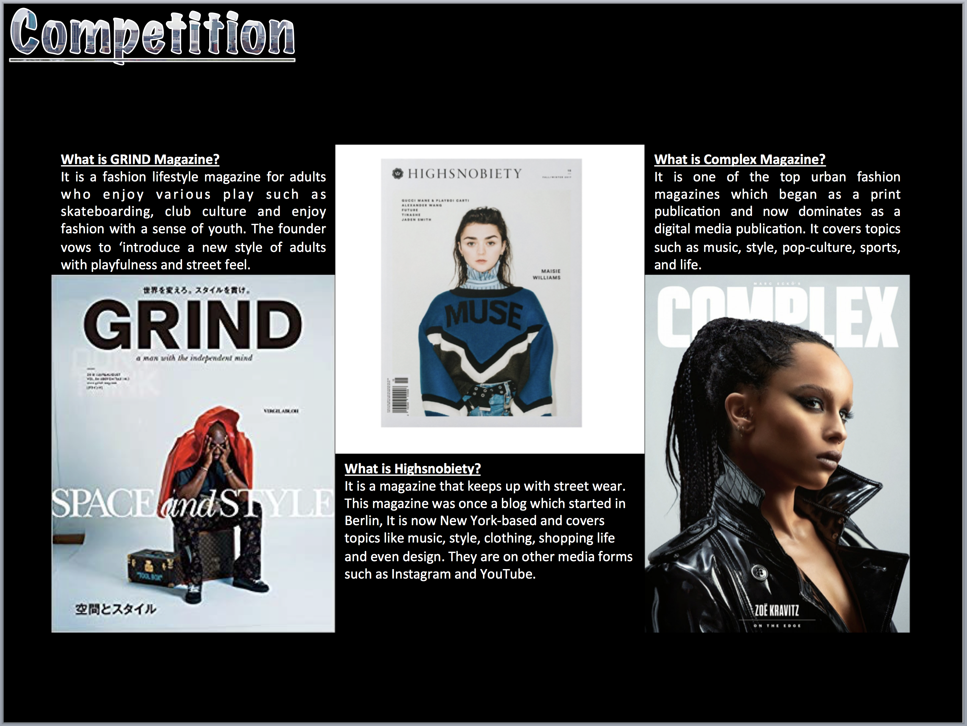
Fashion Research


2D Magazine Front Cover and Double Page Spread Designs
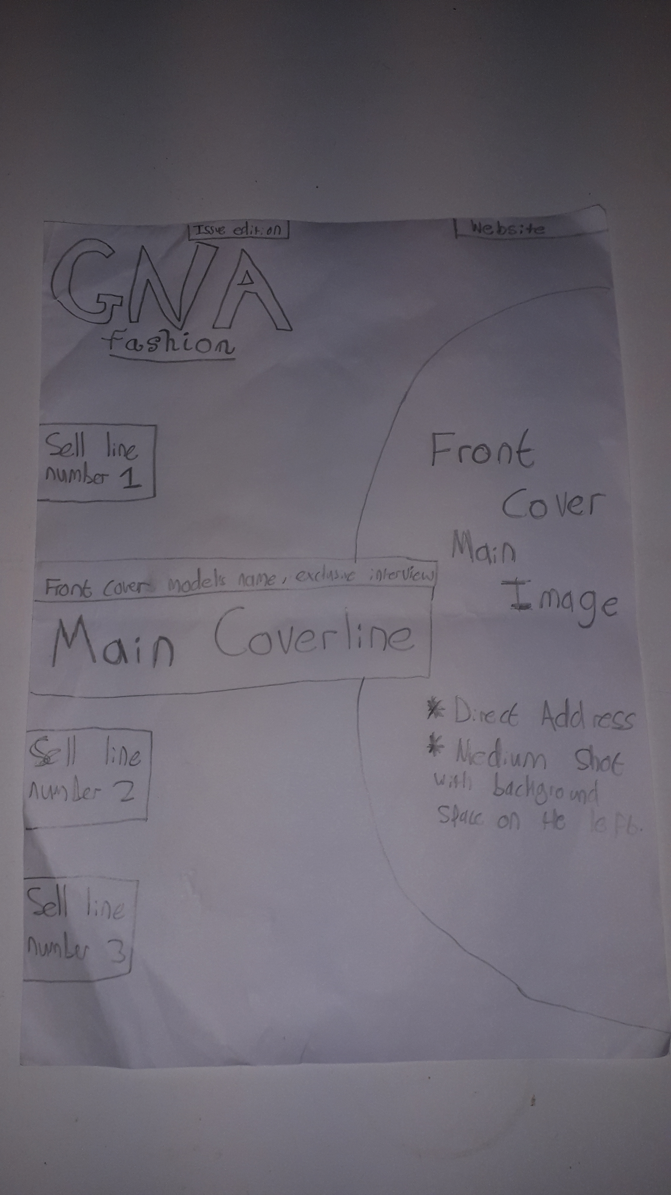

This is the sketch designs of my magazine front cover and double page spread. My art and drawing skills are not the best but I tried my best to visually convey what I envision my final versions will look like.
Test Magazine Front Cover
I created a test Front Cover so I can test my Photoshop skills and experiment with new techniques, that I can use on my final versions of my front cover and DPS. I used this test run as a way of finding out the things I can use for my official projects, these things included the best fonts, type of camera shot of the front cover model, format of the colour scheme and effects.
Inverted Triangle
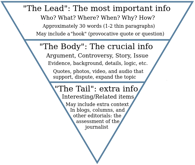
The metaphoric concept of structuring your conclusion which is commonly used in journalism. It consists of putting the most important information first when writing. It is called an inverted triangle/pyramid because it is am upside-down pyramid with the most important information at the top.
Benefits
- The reader can quickly assess if they want to read the whole article.
- The reader can stop reading and still come away with knowing the main point of the article.
- The first few sentences will contain most of the relevant keywords.
- Allows the reader to skim through the first sentences of every paragraph.
Masthead Design


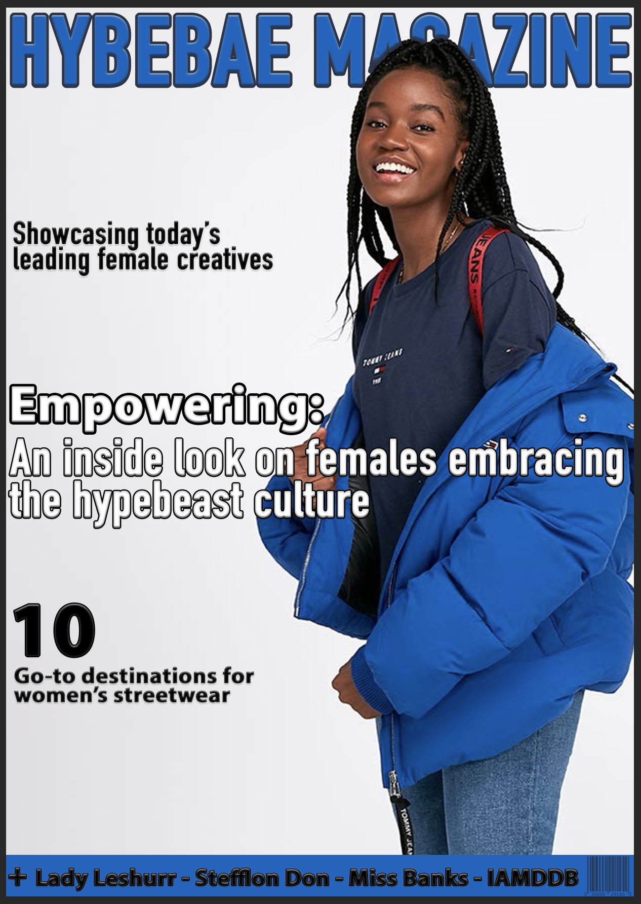
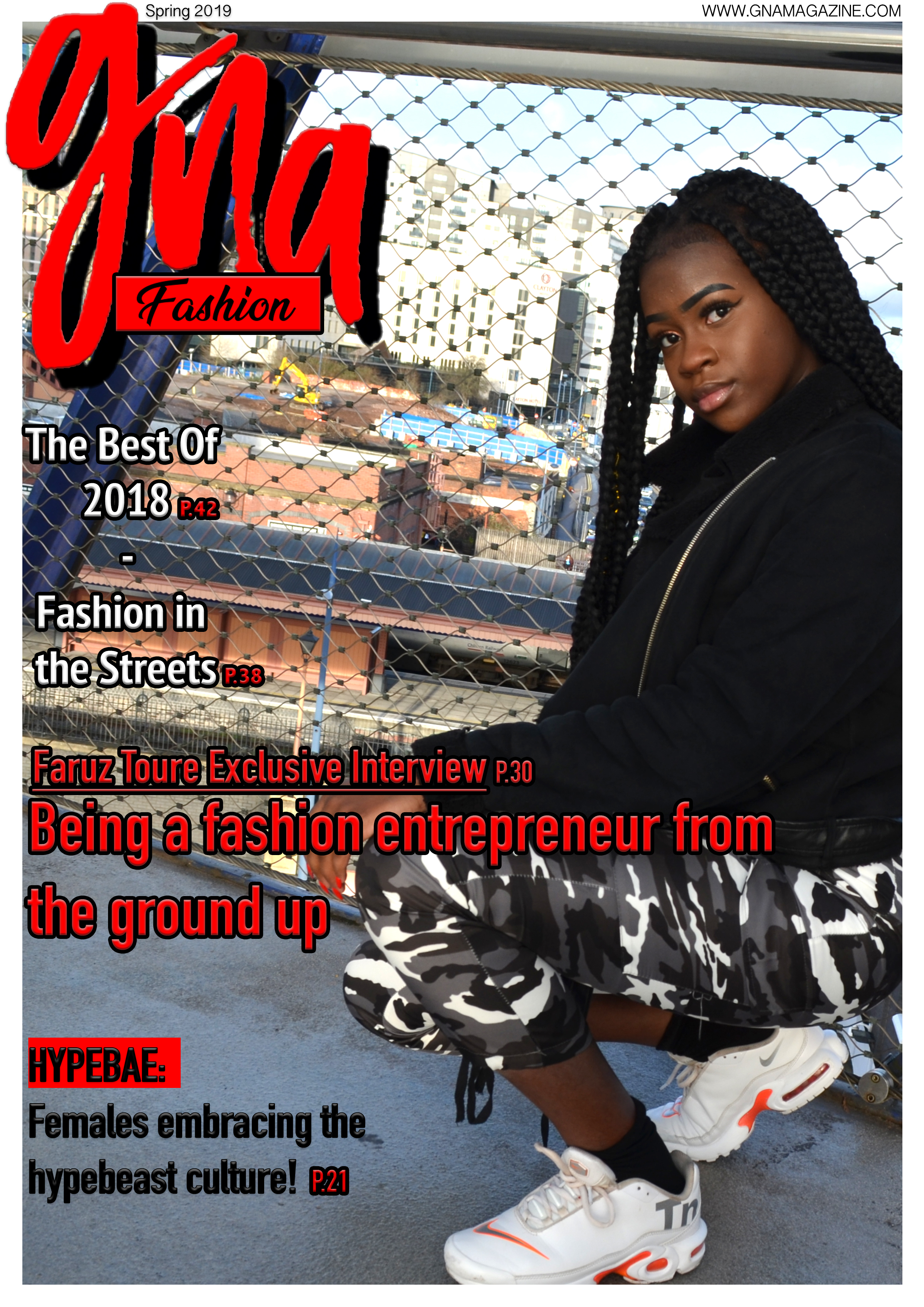
The masthead was preset for this specific project because I was tasked with doing the magazine for the re-branded GNA in mind. The things I changed about the masthead was the main colour. Red was more fitting than pink because it was a subtly from the painted nails of the front cover model, plus pink would be more suited to a high fashion ‘girly’ type magazine than a street-wear one. I also added the issues release/date as extra information about my overall magazine.
Draft of Double Page Spread
The Copy: Imagine being 17/18 years old; where you are probably worrying about your education, having a job, or even doing both. But then on top of that finding the time to build a business of customising fashion. Insane right? Being a teenager can be stressful by itself already so having a whole business at that age too is quite unbelievable. Faruz Toure makes the unbelievable believable and knows how to balance her part-time job with her side business. “I’m fully focused on my part-time job now so there is no more education, it has made maintaining my business easier” said Faruz. She was previously going to college but decided to stop and start working after a period of time.
Her method of starting her own business was through using social media to advertise and showcase her custom work. “Instagram is a great way of showing the work you do through pictures and short captions, its effective and efficient” quoted Faruz. She has built quite a following which grew from her friends following to friends of friends. She exposed her business thorough reminding people to follow her page or telling her established followers to share her page with other people. “My friends helped a lot during the beginning process, the sharing really grew the presence of my custom fashion company”. She hopes of growing the social media presence of her company to new heights for the new year, maybe reaching international heights.
The fashion Faruz likes to customise the most are street wear related. This includes shoes, t-shirts and hoodies/jumpers. She takes inspiration from the recent ‘hypebae’ movement; where females are embracing the hype beast culture. “Girls sometimes like wearing clothes that are made for boys, sometimes they make it look better on a girl than a boy”. Faruz personally embraces the tomboy type of fashion because, it is most likely comfortable and takes less effect but still looks effective. She takes this type of approach with the way she customises her clothes too, just adding a little bit more extra to her projects. Her projects consists of customising already well known brand’s items and someone’s personal brand.
Faruz was emphasising on the fact that anyone can start any type of business, she isn’t a one in a lifetime occurrence. She said “We live in an age where everything and everyone is on the internet, as soon as you present your work on the internet it is literally showcased to the world”. Plus there are a variety of social media forms so you can find one that caters to your presentation style and audience engagement. Back in the day people had to physically expose their product with leaflets or have a limited time to expose their product like billboards. When you are on the internet the whole world is your audience, so it is up to you to make your product as marketable and attractive as possible.
Faruz is proud advocate of the ‘HypeBae’ movement and encourages her circle of friends and her followers to go behind the movement too. Top celebrities such as Serena Williams and Tinashe are also behind the movement and Faruz is interested in potentially collaborating with celebrities in the future. “Everyone likes to feel special sometimes even celebrities, customising their clothes would make them feel even more unique”. Most of Faruz’s models for her Instagram pictures have been her friends, but she wouldn’t mind starting to obtain amateur models/models wanting to expose themselves. However, she is in the process of collaborating with grime artists and customising their items.
To conclude, Faruz stated what her ambitions are and what she is looking forward to in the future. “If this side business takes over the part time job that I have right now, I will fully focus on my company and lead it”. She is starting to catch looking eyes from big stars and would eventually become a ‘customising plug’ for them. Faruz’s story oozes inspiration for all ages (If you’re older than her then you might feel regret) and shows you that if you use the right tools and take advantage of them, you will defiantly prevail in life and be proud of it too. We wished her well on her future endeavours.
Process of the GNA Front Cover Magazine


*Process starts from top left going right, then bottom left going right*
The process started with finding the perfect picture for my front cover from all pictures that I took. I picked out a picture that I thought was going to be the official front cover photo and added the GNA masthead to it. I had a few pictures that I chose to be my official photo so I experimented with another one. I soon as I put the masthead on the second picture I felt like I can begin creating the front cover. The colour scheme came from a small detail in the photo itself; the front cover model’s red nails. I also noticed how the photo needed to be brightened up so there is more life in the picture.
Animated GIF of Front Cover:
Process of Double Page Spread


*Process starts from the top left, top right down, to bottom left and right*
It started with picking what image I will use for the double page spread. I tested all the nominated images on how they look as a DPS but then I found the perfect one. I decided to create the type of DPS where there is the main image on one page and the copy on the other, so there is a clear divide. The masthead/title of the DPS was on the main image side with one of the quotes and link to the model’s work. I did this so there is text on both sides of the page. I added the article/copy on the white side with the other quote and borders; so it breaks the copy up into sections and makes it less intimidating to read.
Final official versions of my Front Cover and Double Page Spread

Evaluation
Our task was to create a sample magazine front cover and double page spread for a re-branded, print now digital media product called GNA. The purpose of the overall magazine changed just before the official starting point, so at first there was in mind to create an original magazine. This was an independent task that tested our literacy and numeracy skills through research and using Photoshop.
The natural thing to do when creating a magazine is to do research on other existing magazine designs and concepts. So I began to analysis existing magazine front covers and double page spreads. The method I used to analysis the covers and page spreads was to lightly label the codes they individually had, and then writing the conventions of the codes in detail in a general way. The 3 covers and spreads were the quantity part of the research which showed different types of the same concept. The general explanations of the different conventions were made sure to be quality, because magazines are using the conventions in different ways but for the same reasons. This helped me with the success of my product because it helped me understand to concepts and techniques I can use for my own product; giving me inspirations and ideas.
In the next stages of researching about existing media, I started to learn about different photojournalists and how they take their images and their styles. This research helped me understand how images can have different meanings and purposes through how they edit and present the objects/living beings. I analysed 3 different photojournalists and explained who they are and what type of images they take, a visual representation of their respective images was created through making collages. The research became practical when I took my own images which had a purpose of being abstract. We used the college environment and surroundings to find normal concepts and making them abstract through the angle of the camera shot and positioning. This helped with the success of my product because it gave existing examples of how images can be manipulated and edited to look a certain way for a certain reason. The practical side of the research was practising the research I collected.
During the research process we were introduced to the GNA re-brand for ViVi Media, so the masthead designs and the layout/format of my magazine front cover and double page spread were preset. The genre I picked for my magazine was fashion but specifically street-wear fashion. The reason for picking that specific genre was because I wear it myself and I’m comfortable with talking about it. To solidify my confidence with doing a street-wear fashion magazine, I made a short presentation about my magazine idea, context, inspirations and layout. Then the construction of my ideas began with the masthead designs, sketches, practice runs with Photoshop and the draft of my DPS article. This all helped me with the success of my product because it helped me with planning out how I will make my magazine, along with being able to practise all the new things I learnt through the research.
The production process began where I started to create my magazine using the raw pictures I took with my model on a scheduled day, and Photoshop software to edit and present my front cover and double page spread. I have done magazine covers and page spreads before so I made sure to make a clear difference between my past creations and new ones. The genre being completely different from before helped to create divergence. Plus it was a genre that I haven’t tried officially for my main project, but I have done test fashion front covers. Those practise runs helped me become comfortable with creating front covers and page spreads in a sharp-witted way. This helped me with the success of my product because practise makes perfect and made me quickly understand what I need to do and how.
During the production process I was making sure to document all the things I was doing behind the scenes, which includes taking screenshots every time my front cover and double page spread changed/improved. It was necessary to that so I can have proof and explain the journey of creating the magazine front cover and DPS. To conclude, my product was a success and I’m proud of it. The process from start to finish was progressive and the project was original. Our task was to create samples for a re-branded media company following their advice and guidelines and I feel like I have fully done that.
